So many students just copy-paste huge chunks of their essay on screen. This goes against the very idea of presentation. You present the thesis, and the visuals are just pedagogic aids. Accessories. Not the other way round.
Older rules said: Don’t put more that 6 lines of text online! Maybe that sounds a bit excessive nowadays, as we have larger screens and better resolution.
But you have to remember this: you have to prepare your slide show for the worst case scenario: a smaller screen than usual; viewers located at the bottom of the room; too much amient light, not enough contrast.
Think of you and the slides as two competitors in a race. One depends on the eyes of the audience, that has to follow lines of text over the screen. The other one, you, depends on the public’s ears that follow the oral discourse at normal speech debit.
Which one do you think wins the race? Who wins every time, no matter what?
It’s the EYES! Always the eyes. The average speed for silent reading is 238 words per minute. But if you’re a fast reader, it could be up to 5-600.
What about the EARS? The ears follow the speaker’s MOUTH, that has a more limited debit: 130 words per minute.
See the difference?
Let’s us say you have a slide with 10 lines of text. That is about 170 words.
The person reading silently will read this in 43 seconds.
You reading this aloud will need 1 minute 31 seconds.
In other words: halfway during your speech (at 0:43) your public will have read all the text on the screen. They will spend the next 58 seconds listening to something they have already read. And feeling bored to death at the unnecessary repetition.
Then… How to avoid the public losing interest? See the next FAQ↓
Do you really need to show all that text on screen?
If your answer is NO, go to the next FAQ #5. If it’s YES, read on here:
Instead of revealing all of the text at once, better revel it gradually at a speed that matches the presumed reading speech of your audience. You cen do thi in two ways:
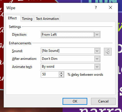
(1) Continuous flow. In PowerPoint, select the block of text, and go to Animation. From the toolbar, select WIPE. Then open the Animation Pane, select your Text, go to Effect Options and select: Direction: from Left; for Animate Text, choose: by word; for % delay between words: anything between 45 and 70 (larger number = slower). Here’s an example:
- (B) Segmented by sentences. If your text can be shortened, think of segmenting it in sentences, or in bullet lines. Then set some animation to go individually for each sentence (or list line) in sequence. In Timing you may choose to control each sentence separately (By Click) or let them flow automatically one after the other (set: After previous).
Advantages: for A: Fewer clicks needed. For B: may adapt to your speed
Disadvantages: for A: You need to correctly evaluate your speech speed; for B. too many clicks can be confusing.
…because I have created a PowerPoint explaining some of those tricks. (If you distribute it, please attribute me as its author):
Afișare text gradat în Powerpoint – download.
If you can condense your text to a series of short intertitles or just key words, there are two options:
(a) The technical way:
Make your short intertitles into a bullet list.
(b). The artistic way:
Make a separate slide for each item and use a large suggestive picture. Think of each slide as a poster. Yes, this will generate more slides with very little text on each, but your audience will feel relaxed to focus on your lecture, while they contemplate the image.
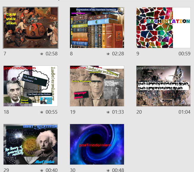
Here are some such poster slides from my PowerPoint presentation of Postemodernism.
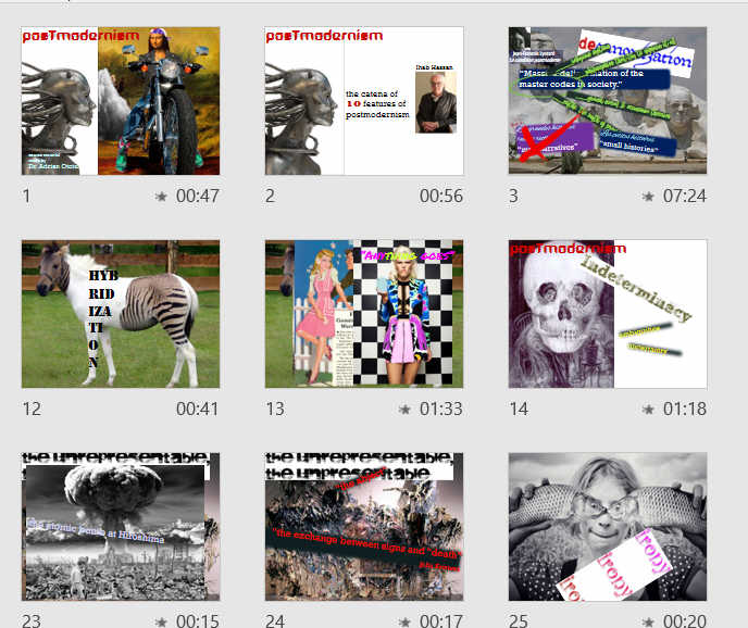
Note how little text there is on each slide:
a. Check your font size! I recommend fonts of about 20-36 points. Never smaller that 16 points!

This slide uses the Raleway font. Even if this is a slender-line font, I used it here in 28 and 24 point size.
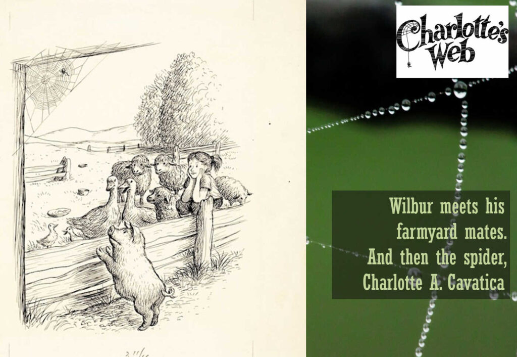
Here the font is a narrow-bodied Rockwell Condensed, at size 28. To increase contrast a semitransparent background was used, set at 50%.
b. Use fonts that have enough weight! Look at the narrowest part of the font. If it’s just a thin line, chances are the people in the last row won’t be able to read it. Prefer fonts that have some bulk, either bold, or heavy varieties.

Here I used the font Open Sans Extra bold, size 20. Set on a darker background, transparency set at 50%.
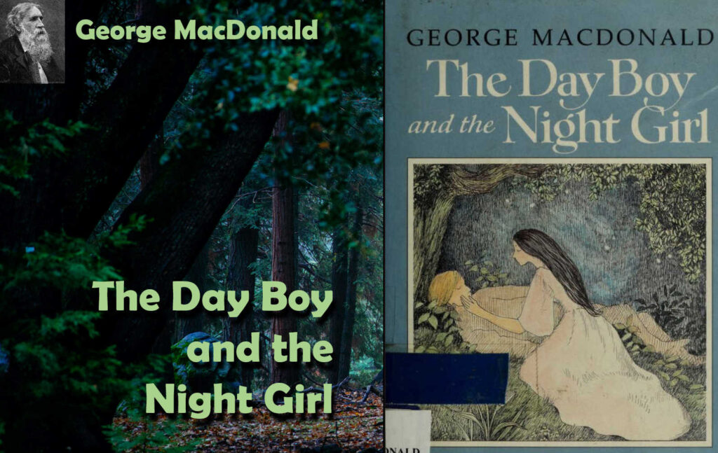
In this slide the title is set in font Berlin Sans FB Semi, size 45. The name of the author is in the same font at 30 pt. Both fonts have some shadow added to increase contrast.
c. Reserve the fancy fonts (cursive, gothic) for decorative elements that are not essential to your subject.
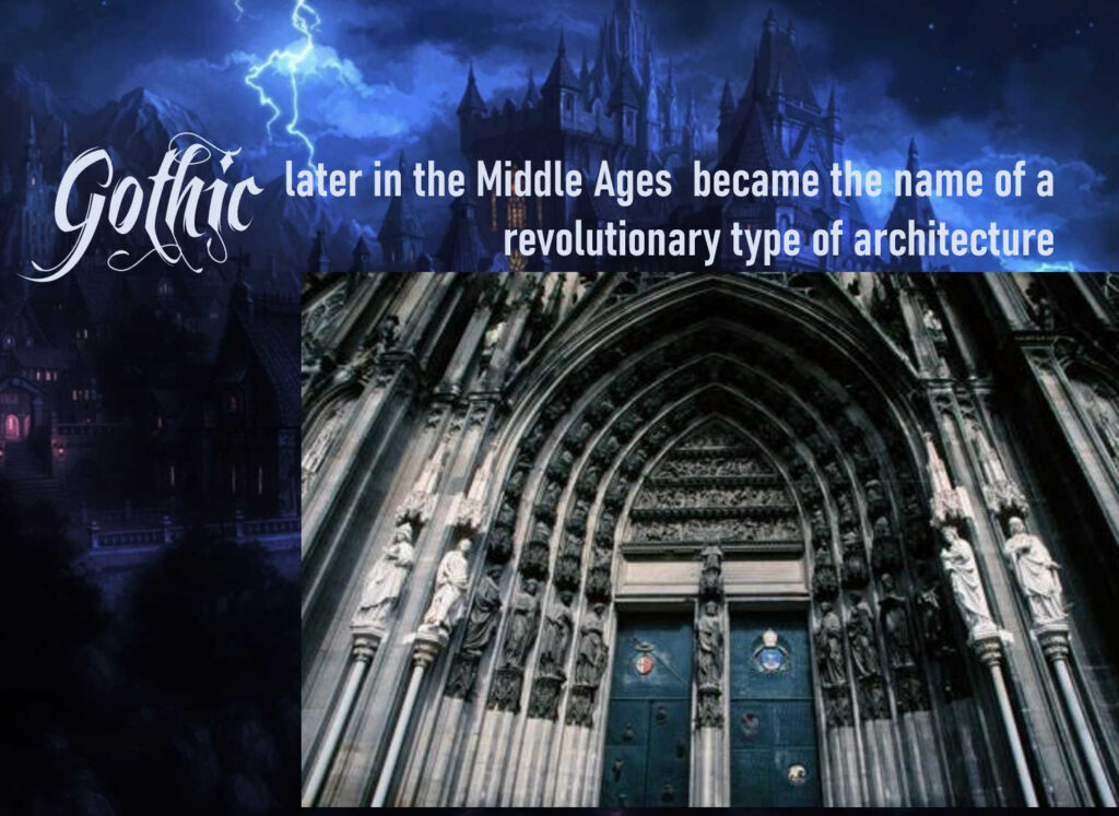
In this slide I used the Gothic font Feathergraphy Decoration only for the title / heading. I avoided using it for any longer text, as it is difficult to read. It s size is 66 points.
The light in the room you will project might be less than ideal. Think of that whoen you choose your theme, and when you decide on colours.
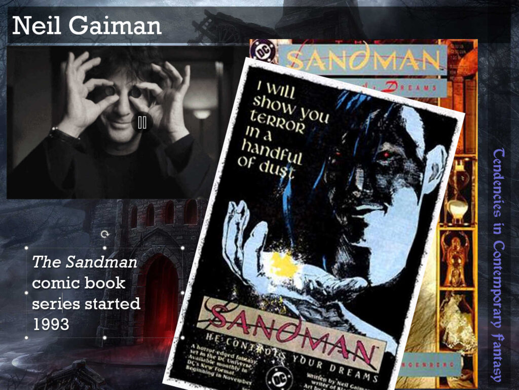
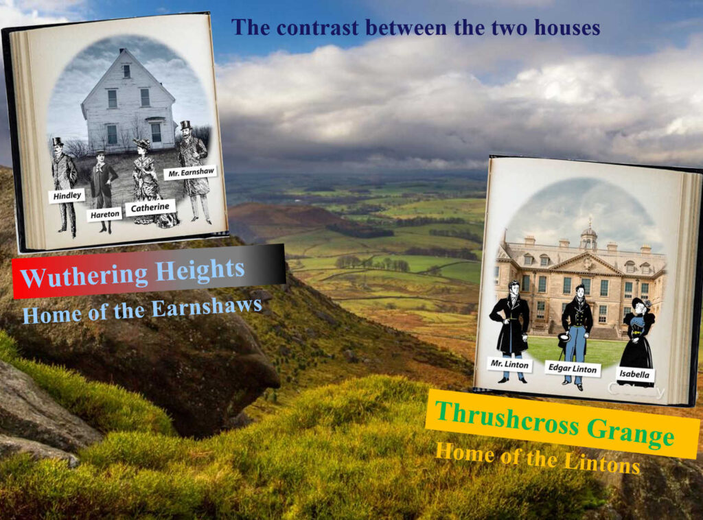
a. Use a background that should not have extreme variations in colour or texture. If your background is too contrasty, then open it in any graphic app and reduce its contrast, or saturation, or add a semitransparent gray filter over it.
b. Go for text/backgroud contrast!
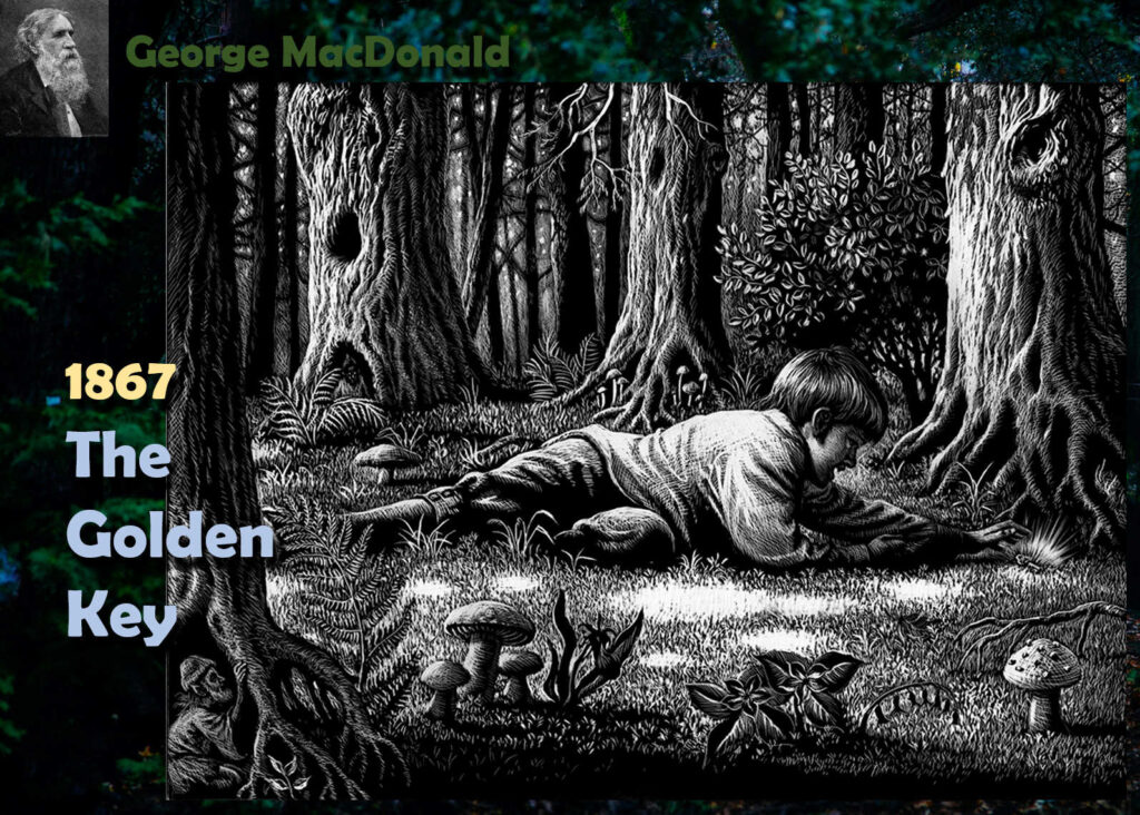
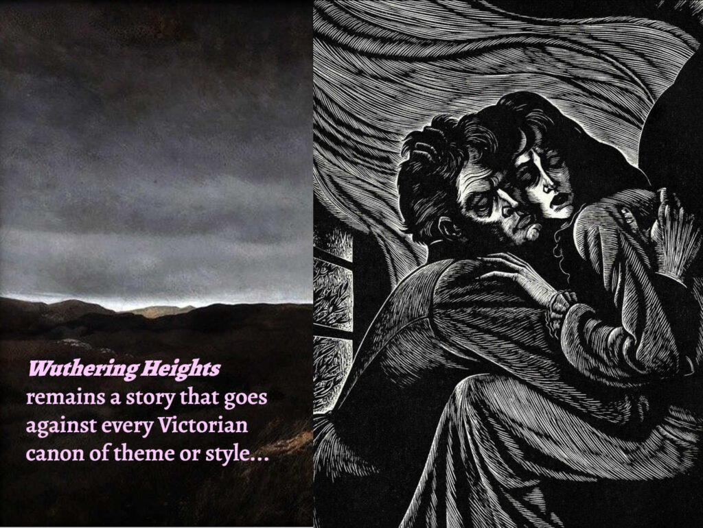
If your background is high-key (luminous) you will choose dark-colored fonts.
If your background is low-key (dark), choose white fonts. (click to enlarge)

c. Make texbox background semitransparent
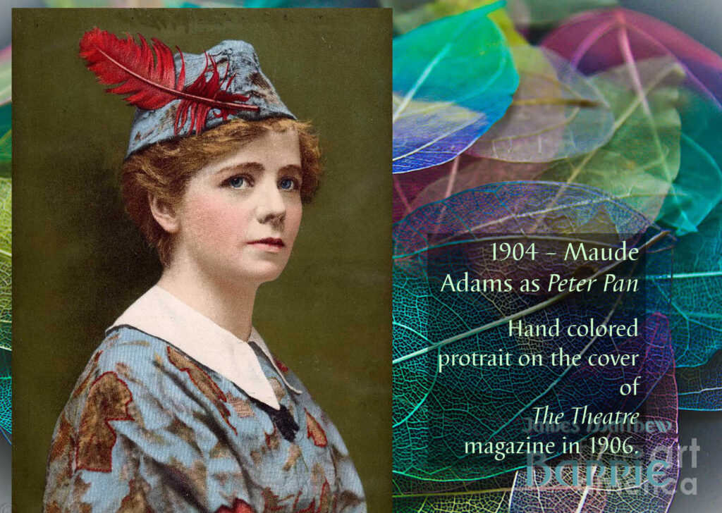
When you insert text on a slide, it stays in its own box, that has a 100% transparent background. You can make this background to have a darker hue. If you leave that semitransparent, it will result in a smokey background that would increase the contrast of your text. How to: While in the text box, right click, select Format image, then add Color some black or dark brown, and then move the transparency slider to 20%-50%. (click to enlarge)

d. Add shade or glow.
If your text does not separate well from the background, you may add some shadows (right-click, choose Format shape, select the top Pentagon shape, and then play with Shadow. For dark environments, you can try Glow.
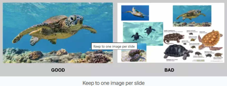
Instead of using 5 or 6 or 7 images, you’d better restrict their number to 2 or 3.
Make those images larger than would appear normal on your laptop. They will surely look smashing on the screen.
Tables are notoriously difficult to read in slideshows.
If you really need to insert a table use the same rules: font no smaller than 25 pts, good contrast, thick lines.
Ideally you should animate the table so that its elements be revealed one after the other. There is an option for that already existing in PowerPoint. Go to the Insert menu, locate the SmartArt icon on the toolbox, then pick up List, and find the preformatted type that fits you.
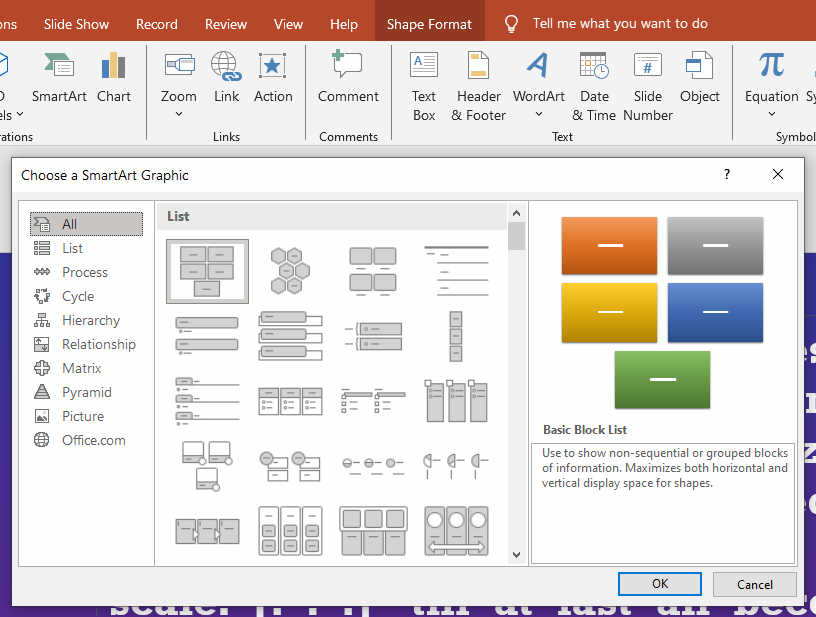
Once you created that table you will see that it responds to each of your click, by adding one more element, and then another one, thus drawing the viewer’s attention to exactly the item you are speaking about.
After you selected the type of table you wish, you need to animate it cel by cell. Proceed as follows:
a. Select the SmartArt Table: Click on the border of your SmartArt graphic to select the entire object.
b. Add an Animation: Go to the Animations tab on your ribbon and select an entrance effect (such as Fade, Appear, or Fly In).
c. Open Effect Options: Click the Effect Options button located in the Animation group on the Ribbon.
d. Choose “One by One”: Select the SmartArt Animation tab in the drop-down menu and change the Group Graphic setting from As One Object to One by One
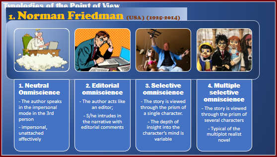
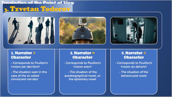
Here are two such animated tables I have used in a slideshow on Narrative Point of View:
When I wanted some object to move about the slide (as I did in the demo slide show about revealing text) , I used to resort to a type of Animation called Lines (or Arcs, or Turns, or Shapes for more complex movements). The problem was that PowerPoint inserted automatically a fixed type of movement, of a certain fixed length and angle, which was difficult to configure.
I have discovered in the meanwhile how simply this can be done by using a newer feature in PowerPoint. This is in fact a transition between the frames, and it is called Morph.
a. Create a slide containing the elements you need. For instance you have a slide with a title an a car image:
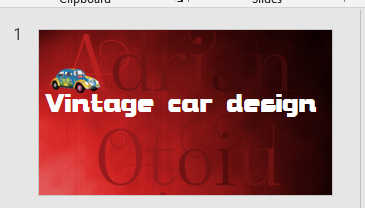
a. Create a slide containing the elements you need. For instance you have a slide with a title an a car image.
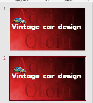
b. Copy Slide 1, either by Ctr-C, Ctrl-V, or by right clicking on it in the left-hand column and choosing Duplicate.
c. Remove all animation from Slide 2.
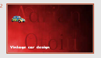
d. In Slide 2, make the following modifications:
d1 – Select the text in the text box, go to Fonts and choose a smaller size (in this image I changed from 80 to 40. Do not edit anything else! Then move the text to the bottom left.
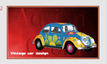
d2. Select the car image, enlarge it to the desired size and move it to the bottom right of the slide.
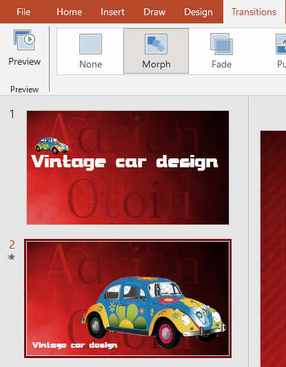
e. Now you will have two images, differing in the size and placement of its two components, the text and the car. Select the second image.
f. Go to the Transition menu, and select the MORPH transition.
This is all! Now when you click to move from Slide 1 to Slide 2, you will have the text decreasing and moving down, wile the car will grow in size and move to the bottom right, as if speeding towards you.
With the magic of Morph, you may try any kind of other transformations: resizing, movement, rotation, squeezing.
Note: If you do not find the Morph option in the Transitions menu, it means you have an older version of PowerPoint, and you won’t be able to use it.